In this blog we will learn how to create responsive modal box in lightning component, with the use of lightning design system and controller.
Creating Modal Box
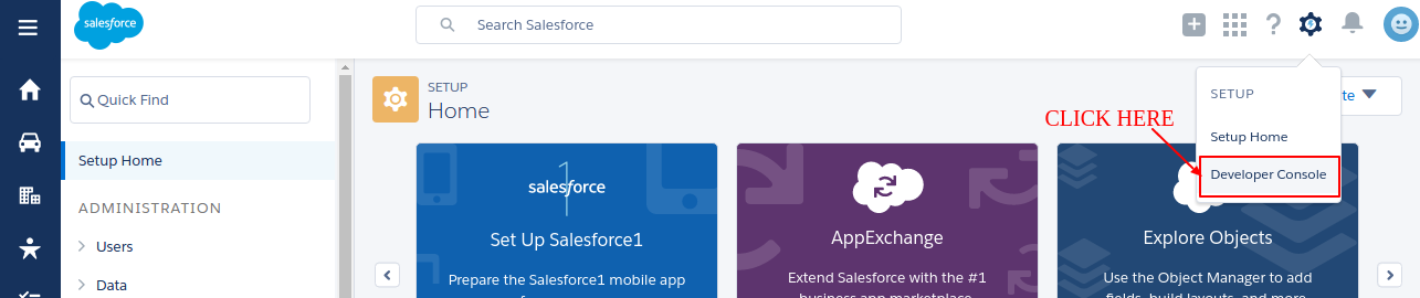
Open Devloper Console.
Create a new lightning Component. File>New>Lightning Component
Write the following Code in the Component:
Component-
<aura:component implements="force:appHostable">

    <!--
    /**
     * Webkul Software.
     *
     * @category  Webkul
     * @package   Webkul_Knockout
     * @author    Webkul
     * @copyright Copyright (c) 2010-2016 Webkul Software Private Limited (https://webkul.com)
     * @license   https://store.webkul.com/license.html
     */
     -->

     <ltng:require styles="{!$Resource.SLDS +
             '/assets/styles/salesforce-lightning-design-system-ltng.css'}"/>
    <div class="wk_static">
        <div role="dialog" tabindex="-1" aura:id="Modalbox" aria-labelledby="header43" class="slds-modal ">
            <div class="slds-modal__container">
                <div class="slds-modal__header">
                    <button class="slds-button slds-button--icon-inverse slds-modal__close" onclick="{!c.removecss}">
                        <span>
                            <c:VehicleSVG class="slds-button__icon slds-button__icon--large" xlinkHref="/resource/SLDS/assets/icons/action-sprite/svg/symbols.svg#close" />
                            <span class="slds-assistive-text">Close</span>
                        </span>
                    </button>
                    <h2 id="header43" class="slds-text-heading--medium">Modal Header</h2>
                </div>
                <div class="slds-modal__content slds-p-around--medium">
                    <div>
                        <p>Sit nulla est ex deserunt exercitation anim occaecat. Nostrud ullamco deserunt aute id consequat veniam incididunt duis in sint irure nisi. Mollit officia cillum Lorem ullamco minim nostrud elit officia tempor esse quis. Cillum sunt ad dolore
                        quis aute consequat ipsum magna exercitation reprehenderit magna. Tempor cupidatat consequat elit dolor adipisicing.</p>
                        <p>Dolor eiusmod sunt ex incididunt cillum quis nostrud velit duis sit officia. Lorem aliqua enim laboris do dolor eiusmod officia. Mollit incididunt nisi consectetur esse laborum eiusmod pariatur proident. Eiusmod et adipisicing culpa deserunt
                        nostrud ad veniam nulla aute est. Labore esse esse cupidatat amet velit id elit consequat minim ullamco mollit enim excepteur ea.</p>
                    </div>
                </div>
                <div class="slds-modal__footer">
                    <button class="slds-button slds-button--neutral" onclick="{!c.removecss}">Cancel</button>
                    <button class="slds-button slds-button--neutral slds-button--brand">Save</button>
                </div>
            </div>
        </div>
        <div class="slds-backdrop " aura:id="MB-Back"></div>
        <button class="slds-button slds-button--neutral" onclick="{!c.applycss}">Open Modal</button>
    </div>
</aura:component>
Controller-
({

    /**
     * Webkul Software.
     *
     * @category  Webkul
     * @package   Webkul_Knockout
     * @author    Webkul
     * @copyright Copyright (c) 2010-2016 Webkul Software Private Limited (https://webkul.com)
     * @license   https://store.webkul.com/license.html
     */

    applycss:function(cmp,event){
        var cmpTarget = cmp.find('Modalbox');
        var cmpBack = cmp.find('MB-Back');
        $A.util.addClass(cmpTarget, 'slds-fade-in-open');
        $A.util.addClass(cmpBack, 'slds-backdrop--open');
    },
    removecss:function(cmp,event){
        var cmpTarget = cmp.find('Modalbox');
        var cmpBack = cmp.find('MB-Back');
        $A.util.removeClass(cmpBack,'slds-backdrop--open');
        $A.util.removeClass(cmpTarget, 'slds-fade-in-open');
    },
})
Output for salesforce lightning
Press Open Modal Button.
You will get the modal box-

Output For Salesforce1
1) Create a tab and add it in salesforce1 navigation menu.
2) Click Open Modal
3) Output.

Support
That’s all for how to create responsive modal box in lightning component, still if you have any further query or seek assistance to make your salesforce classic apps compatible with lightning experience, feel free to add a ticket, we will be happy to help you. https://webkul.uvdesk.com/en/customer/create-ticket/

Be the first to comment.