PSD to Joomla:
This article is all about “Convert Your PSD into Joomla Templates”. Before starting with PSD conversion let me explain why Joomla is most preferred CMS?? After launching Joomla is one of the most preferred “Free” open source frameworks.
With time Joomla being used to build highly interactive websites and extensive eCommerce applications as well. Joomla applicability extends to web content in static web pages to bigger online pools, blogs, online store etc.
Joomla has been established in the year 2005. It is downloaded for around 50 million times till now. Besides, thousands of free and commercial extensions are available from the official Joomla! Extension Directory. Moreover, Joomla comes with a wide set of functional features for building all kinds of websites.
PSD to Joomla Conversion-
There are thousands of web development companies worldwide. These companies providing the service of PSD to Joomla conversion. While web development you have to very specific towards your business goal.
This is the most important step that will put a direct impact on your future goal, business and your visibility on Google.
As you know that world best place to hide is Google’s 2nd page. Now decide where you want to be?
So while converting your PSDs to the website there are a few questions that you should ask yourself, is your website template should include?

- AMP supported template
- PWA supported template
- Responsive web design
- SEO friendly design
- Speed Optimization
What is AMP and how is important in your business objectives?
The first one is AMP( Accelerated Mobile Pages)
AMP has two major impacts on SEO. The first one is “Fast” label designation (similar to how Google shows labels for mobile-friendly pages) on search engine results pages. Second one is that it will be a ranking factor.
AMP stands for Accelerated Mobile Pages is an open-source coding standard for publishers. A Google-backed project designed as an open standard for any publisher to have pages load quickly on mobile devices.

Key Benefits:
-
Enhance your audience engagement:-
AMP Page loading time would be under 1second. As we know that the psychology of the mobile users is full of impatience. It means they have a tendency or expectation to get the things within a second. To engage those customers you should have AMP pages rather than traditional web pages. Otherwise, you have to suffer from the tremendous bounce rate.
-
Maximize your revenue:-
Revenue can be maximized when audience engagement time is increased, that in turn changes of conversation also increases. It is found in an experiment that on every increase in time by 1-second conversion rate falls by 12%-13 %. Here AMP plays an important role. It offers a much faster experience to your customers everywhere, on ads, landing pages, products pages, etc.
-
Maintain flexibility and control:-
One of the good advantages of using AMP is while adopting the AMP format to avail the features of optimizing web components. By this, you can retain your own branding and tooling. It is very simple to build AMP pages, you can convert your entire archive within a day if you are using world’s most popular CMS like Joomla, WordPress.
Case study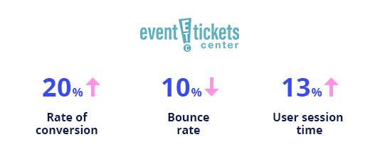
- Event Tickets Center:
A big marketplace in the events online booking industry servicing approx 1.5M customers from past 13 years almost. The company is based out Orlando. Dealing with the online sale of spots and events tickets, providing fans best access to the seats.
This company developed their own AMP pages ( using in-house development team) in 2016. The result of AMP implementation is increased by 20% in the rate of conversion, decrease by 10% in bounce rate, increase by 13% user session time.
- U.S Express:
With one of the largest fleets in the nation, the newest technology, US Xpress has successfully built a culture of family, safety, and innovation. 5X increase in page load, 62% increase in applications, $ 1 Million yearly projected saving. U.S. express received 62% more applications from the AMP landing page. As per U.S. express authority, “AMP enabled us to deliver job offers at incredible speed. It had a direct, positive impact on our ability to hire new drivers.”

- Greenweez:
Again here are some figures of French organic retailer Greenweez. It provides a 5X increase in mobile page speed, up to 80% increase in mobile conversion rate and 66% decrease in mobile acquisition costs. Le Fur is thrilled with the results so far. He shares, “With AMP, we were able to improve mobile performance, achieve impressive results and double our conversion rates. AMP really moved the needle for Greenweez.”
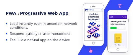
What IS PWA and its role in your business Objectives?
The second one is the PWA( Progressive Web App )
According to Comscore, 52% of mobile media engagement made via using apps.It is because of this, Google is willing to blur the lines between a mobile website and the native app experience, with the introduction of Progressive Web Apps (PWA).PWA is basically in between website and mobile app, it acts as a bridge that fulfills the gap between a website and mobile app. PWA assure the offline service as well as improved speed and performance.
Key Benefits:
-
Offline mode:-
At certain stage websites are limited because of the role of the internet and its speed, connectivity data consume etc. Besides this mobile app is sometimes self-contained it allows users to browse the app even in offline mode. As a result of this increase the user engagement and conversion probability.This work on the principle of saving user browsing data that the user has already accessed. Here is the role of PWA even without internet availability. If in case a user is visiting a page first in offline mode so instead of showing an error message screen in the browser it is feasible to show a complete custom offline page. This is a basic and major reason for the sustainable growth of PWA based template.
If e-commerce companies allowing their visitors to access the product catalog view in offline mode it will put a big impact on chances to retain customers, and customer engagement. The countries where users have to pay per GB data uses, PWA is something like a blessing for browsing an online store.
-
Push Notifications:-
PWA also have the option to implement device-specific hardware features, for example, push notifications. The most important point is that publishers and developers can control the process to implement this option. In fact, users having PWA can also see the icon on their home screen. This would be promoting the brand name and products on each time user use their phone. Therefore there is not an only probability of sales or conversion increase but also brand awareness increase which will have a long-term impact.
It is found that about 60% of users having PWA allows push notifications. Now if you combine this stats then you will find that approx 5-7% of existing website’s traffic convert into push notification accept users among website visitors are downloading PWA form the homepage.
-
Look like App works like a website:-
Nowadays usability is largely shifted from website to mobile app. Hence there are a lot of complications also associated with mobile App, like app submission in play store or I-store. These are waiting for approval data consumption, online mode. So PWA is the best possible solution since it is designed in such a way that it seems mobile app, thus user experience remains the same.PWA can be accessed through URLs like a website. Therefore it is indexable by search engines, that means you can find the pages on Google and bing for an instance.
It is also an easy and straightforward way to integrate the PWA with the existing website or mobile app structure and design. Based on a study conducted by Google 11.5% of the website accepted and download the PWA and this is a good conversion rate.
-
No need of app store submission:-
Unlike mobile apps, In case of PWA there is no need to submit to the app store. Infact PWA can also be found like a website on search engines like Google. PWA is limited to very native hardware support.
Case studies:
- AliExpress:
As we know ALiexpress is one of the popular forefronts of mobile commerce. They developed their own PWA after that it has been observing that 104% increase in conversion rates for new users achieved. It is a tremendous positive achievement with their PWA as compared to their traditional website and mobile app.
- Twitter Lite:
It has been notified that 65% increase in page per session, 75% in tweets and 20% decrease in bounce rate.Twitter lite load under 3 second for repeat visit even under slow network.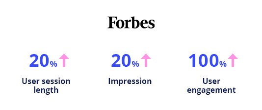
- Forbes:
Forbes PWA show 2x time increase in average user session length, 20% more impressions and 6x completion rate. Its load time is 2.5 sec approx on mobile. As this is a huge difference as compared to 6.5 sec approx of its previous website. Also, Forbes redesigns their mobile experience for mobile users as PWA result of approx 43% increment in sessions per user, 100% engagement and lot.
What is Responsive Web Design and why it is necessary?
The third one is Responsive Web Design
This concept launched in 2013. Nowadays every client is asking for a responsive web design. So, while developing the site from PSD it is so important to make it responsive.
Now, let us see what is responsive web design and use of it?
n
Before 2013, clients use to ask for one design for iPhone, one design for BlackBerry, one for Kindle and so on, along with screen resolution. After launching this approach, design and development must be compatible with a user’s behavioral action and environment based on screen size, orientation and platform.

Nowadays, in responsive design sites use fluid grids, here all the elements are size by proportion, instead of pixels. Let us say you have three columns, you can not say what should be exact wide of each of them. But instead how wide these should be in co-creation to the other columns. Column 1 should take 50% of the page, column 2 must take 30% and the last column should be 20% just for an instance.
Now, one of the big problem associated with responsive web design is working with images. Although there are multiple techniques to resize the images proportionality wise. Among all those options, is to use CSS’s max-width for an easy fix.
Key Benefits:
-
Audiences:-
With the increase in internet and popularity of web application on different devices like tablet and mobile-driven this responsive web design. In responsive design, one site can be implemented across different devices.A study shows that 40% traffic from tablet and mobile devices. Although it depends on country to country in China it can be 60% to 70%.
-
Increase the probability of sales and conversion rates:-
The use of CSS across different devices and unified design approach will put a great positive consistent impact on the look and feel. Thus users will have a positive response since they are getting good experience. Therefore the probability of conversions will sure increase because users are familiar with the navigation and site across different devices.
-
Increase the visibility on SERP:-
This allows you to focus on Search engine optimization. Although SEO paid campaigns are costly and for a specific period of time. Therefore by creating a responsive site, you can optimize your cost of SEO and user engagement.
-
Content:-
Content pay an important factor in SEO. Therefore you should have good quality content and release regularly improves your ranking on SERP. Hence to avoid content duplication, the content should be applied to a single site and that would increase the higher ranking in SERP.
-
Save time and money:-
The primary mindset behind this approach is that it takes less time than that of creating another additional site for mobile users.
What is the role of SEO friendly design?
Forth one is SEO friendly design
In the digital marketing industry, a website is the center of all digital activities. It helps to increase the traffic on the site so that the probability of sales conversion increase.
That is why while design and develop your website you have to take care of SEO standards. By doing this your site ranking increase through organic search improve day by day.
The result through organic search will show the actual traffic on your site. Apart from paid campaigns, those have a short-term impact and costly too.
So, while designing and develop a new site make sure it should be SEO friendly.
Key Benefits:
-
Crawl Link Structure:-
As we know a search engine crawl and read your content of the pages on your site so that search engine can list pages in their keyword-based indexing. The search engine also looking for links in order to find content in the first place. So if you have crawl link structure that allows the crawlers to browse the pathways of a website to find them all of the pages on the site.
In most of the cases ( where the website is not getting good results in SERP) found that they have made a common mistake. Thing is that they have structured their navigation in such a way that it is not accessible for a search engine. This creates a problem in SERP indexing.
-
Content should be Indexable:-
To get a good result in terms of page ranking, SERP listing the content play an important role and it should be in HTML format.

The simple way to increase the visibility is the content. In case if you want to promote to the target audience should be visible to a search engine and for that make sure to place them in an HTML text format.
- So the search engine crawl and accordingly index the page content around the web. Engine keep track of those pages on the basis of keyword indexes instead of storing billions of web pages in one DB. For eg, if you want your page to good ranking in the search results for “Mobile” makes sure that the keyword “Mobile” should be part of your content.
What is Speed Optimization and its role?
The last one is speed optimization
Just to have good content ( text and media content) in your web pages is not enough to decrease the bounce rate and increase the user session time on web pages. Here speed of loading the web pages will also play an important role for sustainable user traffic.
To understand this terminology we have to understand the page speed. It means the time required to download a web page(s) or media content onto your web browser from website hosting server.
A page load time is a time required to open the entire content of that page from the web page to the requesting browser.

An experiment conducted by Google’s engineers found that if page load time just more than 4 seconds is long enough. It results in users to search less. 45%-50% don’t return on the website have poor speed. Due to this site will lose traffic gradually.
It has noticed that 70-75% users of mobile site leave the webpage if it takes more than 5sec to load. E-commerce giant Amazon has to bear the loss of $1.6 billion annually due to every one-second delay in page load time.
How speed optimization impact on business?
User experience is directly proportional to website performance. Better in user experience increase the percentage of the rate of sales conversion. Better in page speed converting the better online shopping experience.
Speed optimization help in better ranking in Google organic search, as better the user shopping experience. It increases the session time thus decrease the bounce rate. Although there are other factors this will also play an important role or better ranking.
Recently research conducted by Forrester consulting firm on the topic of online shopping experience of consumers. It shows how low speed of websites kill the business on the other hand how high speed enhance the sales.
The result of that research finds almost 88% of users want to go with a high-speed online shop. And almost 50% abandon sites those are not able to load within 3 seconds.
Also, almost 79% of users those have visited low-speed sites no longer retain. Among those almost 45%-46% users develop a long-lasting negative thought about those websites.
Case Study

Walmart:-
It has been noticed by Walmart that improvement of page load time by the 1-second result in 2% increase in the conversion rates.
- Firefox figures of download rose by 10millions per year When Mozilla speed-up the page loading time by 2.2 sec.
WEBKUL SUPPORT
I hope this article will help you to understand the complete process involved in the PSD to Joomla website development. If in case you have any query please generate a ticket http://webkul.uvdesk.com
Supported Framework Version - Joomla 3.x

7 comments
Thank you for kind words, kindly generate a ticket at [email protected] for any further assistance.